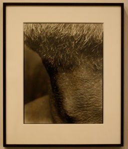
Nicholas Nixon, Self (03), Brookline, 2008. Photograph. de Young Museum, San Francisco, CA.

Nicholas Nixon, Self (03), Brookline, 2008. Photograph. de Young Museum, San Francisco, CA.
A few weeks ago I went up north to San Francisco and decided to go to the de Young Museum. It was interesting because I’ve never been to a museum connected to so many other attractions. It was surrounded by the Japanese Tea Gardens, Golden Gate Park, California Academy of Sciences. The area was so busy with tourists and several cars driving by. de Young was especially busy because it was featuring a King Tut exhibition, but I wasn’t too interested in that and instead, just went into the regular museum.
Nixon specializes in portraiture and documentary style photography. I was immediately drawn to this photo, not because it is black and white (all the photos in the photography exhibition were black and white), but because it was of a neck. The neck is such a vulnerable place and I don’t think people give it much attention. Also, Nixon doesn’t photograph just a neck in place, but an extended neck–the skin is so vulnerably stretched across his adam’s apple.
And the hair and stubble, how it lightly starts to disappear as it moves down the neck.
J
Johannes Vermeer. Girl With a Pearl Earring, c. 1665. Oil on canvas, 44.5 cm × 39 cm (17.5 in × 15.4 in); The Hauge, Mauritshuis.

Johannes Vermeer. Girl With a Pearl Earring, c. 1665. Oil on canvas, 44.5 cm × 39 cm (17.5 in × 15.4 in); The Hauge, Mauritshuis.
I love Jan Vermeer, but I wasn’t really interested in this painting. And I have to admit that I am putting this painting up because I want to talk about the 2003 film. However, I do want to say a few things about this painting. It is interesting how one thing–this pearl–completely changes the painting. The pearl becomes the focal point and makes it unique. If it were not there, would this painting be as “special”? I am inclined to believe “yes,” because I think there is something very pretty about the blue head wrap that is so bright and the slight, awkward parting of the young woman’s lips.
The 2003 film of the same name is based on the the fictitious novel of the same name, that tells of how Jan Vermeer came to create the painting. I have not yet read the novel, but just recently saw the film. In it, Vermeer, played by Colin Firth, is married with a family and hires a second house maid, Griet, played by Scarlett Johansson, who really does look like the girl in the painting. Griet and Vermeer become very close as she becomes his muse for a few paintings. She then sits for him, wearing his wife’s pearl earring, therefore creating Girl With a Pearl Earring.
The movie was a quiet one–there wasn’t much talking between Vermeer and Griet. I have seen self-portraits of Vermeer, but I had forgotten that he had long hair, so it kind of a shock to see Firth with long hair. I enjoyed the historical accuracy, like Vermeer showing Griet his camera obscura or Vermeer manually mixing his colors.
I know this story is fake, but I feel that the girl inside me just really, really want to believe it.
J
Joseph William Turner. The Slave Ship, 1840. Oil on canvas, 35 3/4 x 48 1/4 in; Museum of Fine Arts, Boston.

Joseph William Turner. The Slave Ship, 1840. Oil on canvas, 35 3/4 x 48 1/4 in; Museum of Fine Arts, Boston.
Joseph Turner was a Romantic landscape painter obsessed with depicting the sea/ocean in times of violence or destruction. And in this painting, he was showing slaves being thrown overboard when crossing the Atlantic Ocean during the 18th century. It is said that Turner was inspired by two things–the Zong Massacre and James Thomson’s poem, The Seasons.
I remember seeing this painting at the Museum of Fine Arts and being so completely struck by the rough brushstrokes. It’s so easy to simply “get lost” in this painting with all the colors and figures of bodies. The light of the sun emerging from the background is so serene and beautiful that it starkly contrasts with the dead bodies in the foreground.
A few weeks later, after I had already forgot about this painting, I read about it in Gombrich’s The Story of Art for my art history class. The painting, printed in a book, had no effect on me. I had no recollection of seeing it in person and I actually thought the painting was bland. I just read through the text quickly and moved on to the next page.
So, when going through my iPhoto, and seeing a photo of this painting, I was kind of embarrassed. Mostly because I had “liked” this painting so much in person and then dismissed it in print. But then it just reminded me the great difference between seeing a work in person versus in print. The museum, the other paintings surrounding it, and being able to see it up close, to see the textures, the size, the real colors, makes such an impact.
J
Helvetica Forever


I completely stole this from an graphic design/typography blog I occasionally read, AisleOne.
Helvetica Forever is an exhbition that tells the origins of the font, Helvetica, and will be going to Bulgaria and Germany next. Too bad it isn’t coming to the United States.
Helvetica is such a clean and modern font, it is probably my favorite of the Sans Serif fonts. It may seem like it looks exactly like Arial, but I think it looks a little wider. It also has more of a curve to its letters, like the end of lowercase a’s. And each letter is cut very straight, there are no slants on the tops of the lowercase t’s.
J
Georges-Pierre Seurat. The Seine at Le Grande Jatte, 1888. Oil on canvas, 25 5/8 x 32 1/4 in; Musee Royaux des Beaux-Arts de Belgique, Brussels.

Georges-Pierre Seurat. The Seine at Le Grande Jatte, 1888. Oil on canvas, 25 5/8 x 32 1/4 in; Musee Royaux des Beaux-Arts de Belgique, Brussels.
Seurat brought science and art together. He used the technique, pointillism–painting with small dots of primary colors that create the impression of secondary and tertiary colors. The idea was based on breaking color so that, when looked from afar, it creates a mixture of colors.
With summer quickly approaching, I was drawn to the blues that create the ocean, even with the yellow and the red dots. It makes me excited for the bright sun and blue ocean, even though we don’t sail in California.
But really, I chose this painting because Seurat reminds me of my first encounter with art history. In elementary school, we had these lectures, Masters of Painting. I’m not sure if that is the correct name. But I remember all the fourth, fifth, and sixth graders filing into the “library,” sitting cross-legged, shoulder to shoulder, and we’d look at art slides, with each time being a different artist. I used to love them because they were like a mini-fieldtrip, but I sometimes got in trouble because I couldn’t stay silent for an hour and a half. And after every lecture, we’d return to our classrooms and attempt to emulate or imitate the artist’s technique. I remember after the lecture about Seurat, we were given Q-tips, paint, and paper. With the Q-tips we painted enormous dots, that were actually really ugly, but I guess the point was that we understood the technique of pointillism. I’m angry at myself for not appreciating these lectures and experiences at the time.
J
Édouard Manet. The Rue Mosnier with Flags, 1878. Oil on canvas, 25 3/4 x 31 3/4 in; J. Paul Getty Museum, California.

Édouard Manet. The Rue Mosnier with Flags, 1878. Oil on canvas, 25 3/4 x 31 3/4 in; J. Paul Getty Museum, California.
I don’t like to admit that I love Impressionism. It’s because in every museum there is a room for Impressionism and Post-Impressionism paintings and that one room is always flooded with people. And I don’t want to be lumped in with those people. But there is a reason that this artwork is so popular–it’s easy to understand and easy on the eyes. It isn’t some “history” painting, but a colorful and beautiful image of nature.
I usually don’t like Manet paintings that much, but seeing this painting in person this past Spring Break changed my opinion of Manet. Even though he was an Impressionist (Realist, then Impressionist, after meeting Monet), he still used a lot of black in his paintings. And it seems like this painting is a departure from that. The red, white, and blue of the French flags really stand out and grab the viewers’ eyes.
There is something in this painting that makes me so happy–I don’t think it is just the colors, it might be the “patriotic” feeling or something else. I can’t really pinpoint it.
J
Johannes Vermeer. The Little Street, 1657-1658. Oil on canvas, 54.3 cm × 44 cm, 21.4 in × 17.3 in; Rijksmuseum, Amsterdam.

Johannes Vermeer. The Little Street, 1657-1658. Oil on canvas, 54.3 cm × 44 cm, 21.4 in × 17.3 in; Rijksmuseum, Amsterdam.
Once again, I judged a Northern painter. Like I did with Jan Van Eyck, I thought Jan Vermeer was boring. I was uninterested in Dutch paintings, and I know I am making a very large statement here, but I think most people are uninterested in Dutch paintings. It is probably because most of the time, we are exposed to Southern painting–Da Vinci, Raphael, Michelangelo–those names are all familiar to us, and their style of painting is, as well. But when I finally learned about Dutch painting, its techniques, style, and themes, I became to appreciate it so much more.
Jan Vermeer is probably most famously known for his paintings depicting Delft (especially View of Delft). He specialized in domestic interior scenes of everyday life, many of his painting are of women accomplishing domestic chores. He also uses bright colors, most notably blue and yellow.
The technique he used is called pointillé (not pointilism), where patterns were formed like punched dots. Vermeer understood the eye and the way it worked so well, that he painted based on the way the eye would receive the picture. So, in The Little Street, Vermeer didn’t completely paint the cobblestones (in fact, he never outlines any of his figures with black) because he knew that the eye would pick up the colors and shapes and automatically know that they were cobblestones.
The image copied for this post does not do the real painting justice. The colors aren’t as bright and certain features aren’t as distinct. But other than that, this painting is so simple–I feel like Vermeer just wants to show us what Dutch life was like. It’s so calm and the two women appear to be very concentrated on their work, as though they are not affected by a viewer or others. Vermeer was able to make ordinary life so beautiful.
J


1 comment